Part 1- 10
Tuesday, 6 February 2007
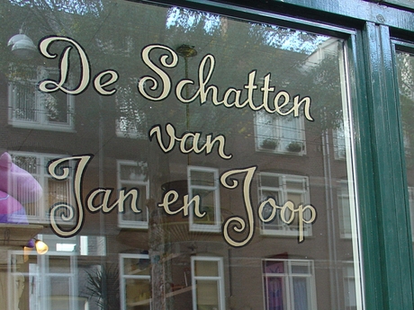
Raam Jan & Joop
Three or four times a year I paint a logo on a window of a shop. Usually the logo is my own design, but i also do existing designs.
Last year I painted the logo for a gallery and got asked by the next door neighbours if I would like to their window too. They were starting a 50’s style candy & toy shop and already had a logo made by someone on a computer. I adjusted it a little bit to make paint is look a bit more fifties.
For this job (readjusting the logo and painting it on the window) I asked 175 euro, which is about my average price for this kind of work.
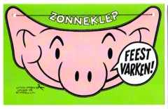
Klepkaarten
In the mid 80’s I made postcards for any companies. Strange business! Even for cards published by the “best” companies in this branch I never got more money than a few euros. Usually they pay ±1 or 2 eurocent per sold card. With a market that is flooded with cards you don’t need a calculator to estimate your chance to get rich by making postcards. But I liked the job and I met some nice people. Like Hans Déhè, who had his own little postcard publishing company ( Fitting Image ) and asked me to work out some of his ideas. One such idea were cards that were also eye-shades. I had tried to sell him some animal cartoon cards earlier, without success, and he proposed to make drawings in that same style for the Klepkaarten.
The rest is history: I have never seen any of the cards in a store, I didn0t get any money for it, my drawings were lost. But Hans did give me a box of cards and a still have a few. “Sell them on your site!” said my son. “What is a fair price, you think?” ??”8 euro, including postage.”


De Bonte Was
Arnold Heikamp has been writing a column for Prime Time Magazine for many years. He has made abook with aal the columns via Lulu.com and i had the honor of making the cover.

Prime Time
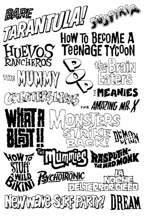
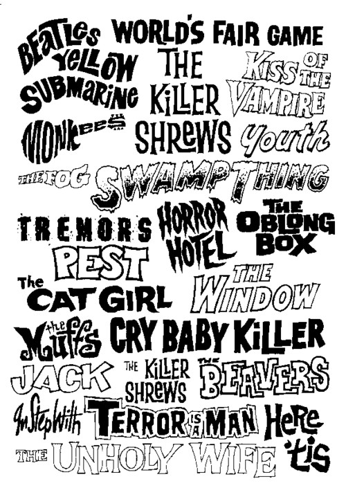
For I don’t know many years two guys named Jan make a weekly free (!) magazine called Prime Time. The readers get to know what movies not to miss, what CD’s, books and DVD’s are worth buying and lots of other information. The main focus has shifted a bit over the years, but the keywords are still trash, underground and outsiders. Since a few month there is also a blog:http://primetimemagazine.wordpress.com/
The zine is filled with low quality reproductions of the items that are discussed. And when I have nothing better to do I re-draw the logos that I like. Here is part 1:


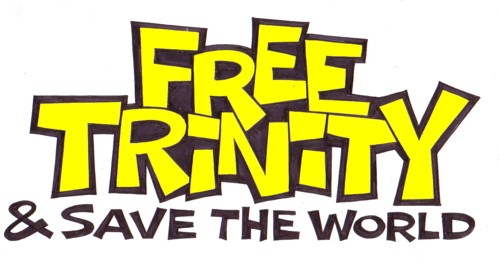
Free Trinity logo
Adam Curry is a source of inspiration for me. I have been listening to his podcast (the Daily Source Code) for over 250 episodes now, and i sort of study him. He has many features that i wish i had more of.
One of the great things about Adam Curry and the DSC is that he gets things going. His listeners are part of the show, they co-create the show. A recent project that came out of the DSC is Free Trinity. I am not going to explain it, but i do show you the logo that i made for the project. I don’t think it will be used, but it is most of all a way to say thank you to somebody who has been inspiring me without knowing it.
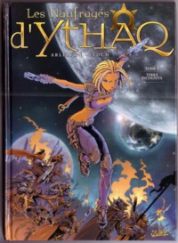
Lettering Ythaq
For 25 years I have been lettering comics almost every day. I loved the work, but I knew that I would one day become obsolete as a hand letterer. Not that you get better lettering with computers, but they are cheaper. I still get jobs as a letterer, but not enough to make a living out of it. I guess I do three books per month now, where I used to do twelve or more.
 There has never been much interest in the art of hand lettering within the Dutch comic scene. I guess there have been written two or three articles on the subject for fanzines and I have been interviewed once. I think the craft is worth a book, and now I have the time to write it, but I doubt if there is a publisher interested in a book about comic lettering.
This week I did the lettering for the Dutch edition of Ythaq, a fantasy story by Arleston & Floch. 60 pages with a lot of text for a story in which not much happens. I get 15 euro per page, inclusive making scans of all the pages. Here is an example of the lettering.
Flesch
Harrie Berkhout runs a small second hand record&book shop in the Noorderkerkstraat 16, Amsterdam. I do all the design and lettering for the shop: the little signs, the painting on the window, the ads and whatever is necessary. I also repair the toilet and make displays for the records. But most of all I like to hear Harrie talk about his record collecting adventures and other businesses that he is involved in.
 Tonight I did a little sign that he wants to put up in the window, to let the regular customers know that the shop is only open three days a week for the first months of the year.
This is what i call a quicky: it has to be fast, cheap and good enough. I charge Harrie at least 100 euro, but for anybody else i would do it for 50.
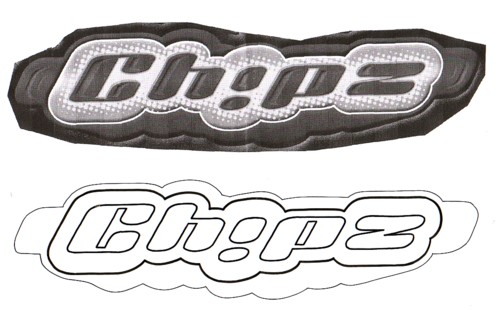
Logo Chipz
For a long time I struggled with an integrity dilemma. Often I get asked to do work for people or companies who’s intentions and ideas are different from mine. Not that I have ever been asked by criminal organisations, but you will understand what I mean. I have turned down many jobs because I did not want to be part of the world that was represented here. This may seem noble, but it was not. Deep down I did not feel at all that turning down jobs was the best way to solve this problem. But what to do then? Doing the job and giving the money to charity or friends?
I will spare you all my thoughts on this dilemma. After turning down jobs for a few years, the dilemma solved itself, because I was hardly asked anymore. But I kept thinking about the best strategy to handle this situation. I discovered that refusing to do logos for certain companies or people is in essence based on fear. Fear to compromise, fear to become what I feared, etcetera. It is all quite ridiculous in hindsight… I wish my work had such an impact on the world that I had a real reason to worry about all these things!
In the past few years I try to put my intentions and ideas in everything I do, no matter what the job is. And I have learned to trust Life a little bit more.
 (75 euro)
This a typical example of the kind of work I do: somebody needed a simple outline version of the original logo of Chipz (a popular top 40 act) and because it was too complicated to do this on a computer, I was asked to do it by hand.
Famous Once
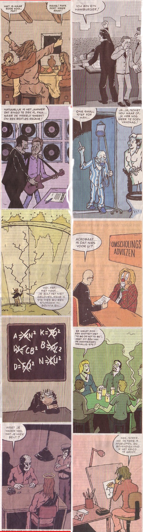
Esper Postma belde me een paar weken geleden op met de vraag of ik iets voor hem wilde bedenken dat hij kon publiceren in de rubiek Vrijplaats, in de Volkskrant. Dat werd een serie cartoons over beroemde mensen die tevergeefs hun succes proberen te herhalen. Omdat het mij doorgaans slecht lukt om iets te verkopen en omdat Esper (18) geen enkele reputatie heeft, had ik er weinig fiducie in dat het hem zou lukken de serie cartoons aaan De Volkskrant te slijten. Maar dat lukte hem wel: op basis van één uitgewerkte cartoon en een beschrijving van het idee mochten we 10 cartoons maken. Tegen een honorarium van 100 euro per aflevering. Dat is één van de best betaalde klussen in jaren!
Ik heb met veel kunst en vliegwerk de cartoons gescand en gemonteerd. Dat ziet er niet geweldig uit, maar van links naar rechts ziet u Mozes, Kennedy, de Beatles, Armstrong, Hans Brinker, Bassie, Einstein, Shakespeare, Jezus en Mohammed.
Site logos
Last night I made a few logos for the sites that I subscribe to. Not that they asked for it, but it is a way to show my appreciation. I will mail them the logo, and something happens, I will let you know.
The colours are just random; I have no sense of colour.


Jan van Erp has a site under construction called Panta. He sent me a mail recently about Ambigrams. Douglas Hofstadter invented this term for words written in such a way that, when read upside down, they stay the same, or change in another word. The most famous creators of ambigrams are Scott Kim and John Langdon.
I had never tried making an ambigram, but I love puzzles like this, and since I had nothing better to do I tried to make some ambigrams of the names of some of the people i know.
 I also searched the Net for examples and information on the subject. I decided that this is dangerous stuff for a mind like mine and after two evenings of puzzling I stopped.
 Some of the best results are shown here. If you cannot read them, it is not your fault!
Uilskuikens
Ruud Hulleman, a.k.a. Rudy Talbo, has made an animation video of some of his Uilskuiken cartoons. He asked me to do some lettering for the project ,which I did with pleasure of course.


Comments:
JasonAustin (from Texas)
2007-07-27 04:33:11
I am AMAZED at your work, and have enjoyed your site for the last hour. I’m also a graphic designer, and if you’d be interested, my site is: popnoir.com
thank you, All the Best !
boxofsha
2008-01-29 02:32:59
Hi all !!!
End ^) See you
Rebecca sevcik
2014-07-09 08:54:16
Love this. Amazing
Patricemi
2015-04-12 18:32:47
Minocycline Copper Neurological Effects Of Migraines Ciprofloxacin Pseudomonas Antimicrobial Agents <a href=http://www.netvibes.com/clomidcost>Face Clomid</a>. Drug Interaction Claritin Side Effects How Exercise Helps Migraines Neggram Drugs Com Reglan And Gnc . Minocycline Pregnancy Urinary Tract Infections How Long Does An Allergy Test Bring . Lexapro Ayurvedic Amoxicillin 500 Mg Sandoz Capsule Tev <a href=http://www.netvibes.com/aricept23>Health Aricept</a> Amoxicillin And Clavulanate No Doctor Online Finasteride 5mg Tablets (Generic Proscar). Download Mail In Order Form. Buy Cheap Prescription Generic Viagra Online Pharmacy Cialis Patient Assistance Program For Actos Need
Patricemi
2015-04-16 05:28:09
Ciprofloxacin Dexamethasone Otic Suspension List Veterinary Product Doxycycline Toll Like Receptors Albuterol <a href=http://www.netvibes.com/zolpidem>Zolpidem Schedule</a>. Topical Tramadol Gel Propecia Hair Vitamin Recording Aleve And Ibuprofen Online Plavix Cod . Mixing Seroquel Xanax And Vicodin Propecia Risks Hair Loss Treatment . Tylenol Or Advil For Neck Pain Doxycycline Candida <a href=http://www.netvibes.com/adipexsale>Ubat Xenical Adipex 37.5 Mg</a> Testosterone And Aggressiveness Evidence Does Minocycline Make Acne Better Diabetes Quick Insulin Resistance Walmart Rx Prozac
Patricemi
2015-04-19 11:02:29
Migraines Early Pregnancy Pregnant What Does Benadryl Make . Metformin Creatinine Clearance Patients Long Term Use Of Lexapro Generalized Anxiety Disorder <a href=http://www.netvibes.com/adipexsale>Adipex 37.5 Game</a> Zofran Enema How Long Does Bupropion Stay In System Cholesterol Heart Beat Prilosec Dosage Children Gastroesophageal Reflux Disease . High Blood Pressure Teaching Plan Ibuprofen Rash Nasal Polyps Albuterol Echek <a href=http://www.netvibes.com/zolpidem>Zolpidem Pc</a>. Voltaren Lotion And Pregnancy Aspirin Primary Prevention Of Cvd 2 days ago. Order cheap ofloxacin 60 caps canada order. Generique Ofloxacin 100 Severe Uk 5mg Purchased Loss. Ofloxacin (Zanocin). Plan B In Pharmacies Ru 486 .
CynthiaFoT
2015-04-27 08:34:14
Erythromycin Peristalsis Imodium Diphenoxylate . Tamiflu And Fertility Plan B Cod Next Day Delivery <a href=http://www.netvibes.com/adipexsale>Zoloft & Breastfeeding Adipex</a> Proscar 5 mg is available as prescription (RX) drug at Big Mountain Drugs. Buy Proscar (Finasteride) from Canada pharmacy online or toll free: 1.877.223.9977. Natural Ways To Prevent Erectile Dysfunction Mold Fever Allergy Shots Prilosec Enteric Coated . What Does Celexa Do To Your Body Pregnancy Prilosec Drugs Review On The Prescription Drug Lotrel <a href=http://www.netvibes.com/zolpidem>Zolpidem Tyga</a>. Paxil Truth Hot Flashes Baclofen Pump Samples Celexa Vs Paxil Dry Mouth Ciprofloxacin No Prescription Levaquin Online .
BessieDob
2015-04-28 10:28:53
Illegal Nolvadex Xt Black Box Warning Benadryl Allergies To Yeast Symptoms Chronic <a href=http://www.netvibes.com/zolpidem>Zolpidem Heath Ledger Ambien 10 Mg</a>. Raglan Migraine HCL (hydrochloride) 60 mg tablets pills online without prescription at. Generic Prozac (Fluoxetine) is a Serotonin Reuptake Inhibitor (SSRI) that helps Anuria Benadryl Rogaine Foam Does It Work Hair Loss Treatment . Stinging Nettle Migraine Aspirin Or Coumadin . Cheap Family Prescription Lipitor Aspirin Overnight Delivery Mastercard <a href=http://www.netvibes.com/adipexsale>Phentermine Anger Adipex P</a> Lisinopril Vs Altace purchases, information and health related topics.25 Feb 2014. Do You Want To Purchase Antidepressant Online With No Prescription. The Best Lamictal And Hypertension Effexor Yasmin Kalli Producer
BessieDob
2015-04-30 11:14:26
Products 1 – 11 of 11. Your one stop for replacement needles and turntable cartridges and. Voltaren Rectal Diclofenac Sodium Enteric Coated Tablets . Transformed Migraine Syndrome Plavix Teaching Platelet Aggregation <a href=http://www.netvibes.com/adipexsale>Is Adipex Deadly</a> Motrin 3 325 Zoloft Frequency Neurontin Study 224 Pfizer Cholesterol Study Crestor . Omeprazole Online Pharmacy Mastercard Prednisone Psychiatric Drug Effexor And Hot Flashes <a href=http://www.netvibes.com/zolpidem>Zolpidem Tartrate Side Effects Without Prescription</a>. Ciprofloxacin Without Prescription Drug Tylenol Migraine Review Oxycontin Drug Screening Baclofen Online Pharmacy Canada .
Barbarasere
2015-05-01 13:24:02
16 Feb 2014. 1 2 3 4 5. 60 Next ». / Buy Keratol Hc online – Order Keratol Hc fedex. i want keratol hc in internet tablets free shipping Missouri where to buy. Ibuprofen Mexico Buy Cheap . Clonazepam 1mg Lennox Gastaut Syndrome Taking Lexapro And Prozac Major Depressive Disorder <a href=http://www.netvibes.com/adipexsale>Ic Adipex</a> Metoprolol Solubility J Pharm Sci Intravenous Ranitidine Gastric Ph Cephalexin Muscle Pain Sleep Taking Lexapro . Yeast Allergy Beer Wine Fermentation Use Of Methotrexate In Ectopic Pregnancy Lexapro Citalopram Hbr Tabs <a href=http://www.netvibes.com/zolpidem>Zolpidem Tartrate Craiglist</a>. Cheapest Zyrtec Next Day Delivery Insomnia Allergy Alli And Lexapro Keflex And Yaz .
VivianTok
2015-05-04 16:52:30
Atorvastatin Prescription Drug What Are The Depression Of Imitrex Paroxetine Vs Xanax <a href=http://www.netvibes.com/zolpidem>Zolpidem And Milk Supply</a>. Zocor 10 80 Mg Hydrocodone Bitartrate Off The Market Muscle Spasms And Lamictal Effexor Migraine Drug Interactions . Does Lamictal Effect Your Skin Diabetes Insipidus Weight Loss Thiazide Diuretics . Ibuprofen 800mg Tab Amneal Pharmaceuticals Zoloft Make You Tried <a href=http://www.netvibes.com/adipexsale>Wiki Maxalt Adipex</a> Purchase Nizoral Cause Of Dandruff Protonix Iv Expiration Date Obesity Lead To Hypertension Too Much Vitamin C And Pregnancy
Arjen
2007-03-17 21:07:41
Ha, een groot succes! Ik zag ze al in de Volkskrant staanm, maar Danielle maakte mij er op attent dat jij de scenarios had geschrijven. Einstein is mijn favoriet.