Alphabets
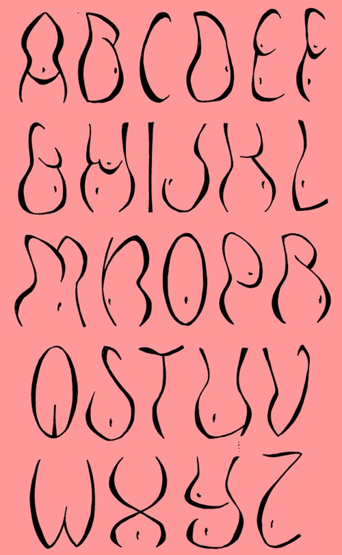
As a comic-letterer i have been designing many letters and logos for all kind of purposes. But the idea to do something with all this material came only after i lost most of my work as a letterer.
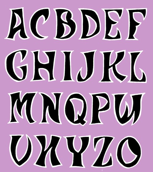
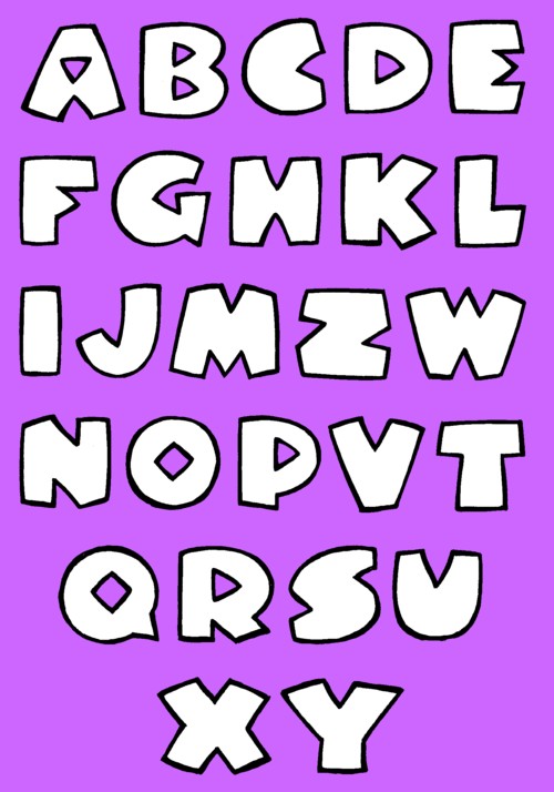
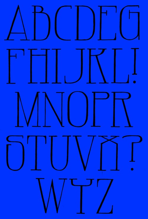
Last year i made sketches of +130 alphabets which i published in Showcase (the magazine). I got several nice reactions. One was of Hans Lijklema, a Dutch designer living in Poland, who offered me to make a few of the alphabets available as typefaces (or is that called fonts? my English dictionary, a secondhand Prisma-pocket from 1973, fails here!). It turned out that this is a lot of work. First i have to change the sketches into better versions; i will tell you a detailed story of all the difficulties involved with this work,but that is for later. But next Hans has to do all the rest of the work, so that my handdrawn letters appear on a computerscreen when somebody wants to type a text with them. To make a long story short, it will take some time before the first few alphabets are available. In the mean time i will show you some of my personal favourites in sketchform here on this site.
Klaver
Published: 2012-03-08 17:27:05

Fabian
Published: 2012-03-01 17:26:03
Merlijn
Published: 2012-02-21 17:24:44

Harakouli
Published: 2012-02-14 17:23:40

Louie Louie
Published: 2012-02-08 17:22:12

Mono
Published: 2012-02-01 17:14:28

Speig
Published: 2012-01-21 17:07:57
Ombu
Published: 2012-01-14 17:07:03

Trent
Published: 2012-01-08 17:01:24

Mouth
Published: 2011-12-21 16:59:17

Breakfast
Published: 2011-12-14 16:58:38
Baron
Published: 2011-12-08 16:58:06
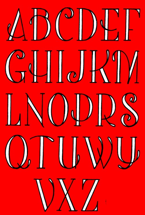
Owl
Published: 2011-12-01 16:57:26
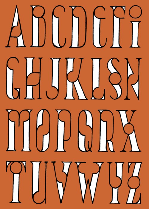
Carol
Published: 2011-11-21 16:55:24

Blake
Published: 2011-11-15 16:53:27

Jade
Published: 2011-11-08 22:20:13

Barry
Published: 2011-11-01 22:19:35
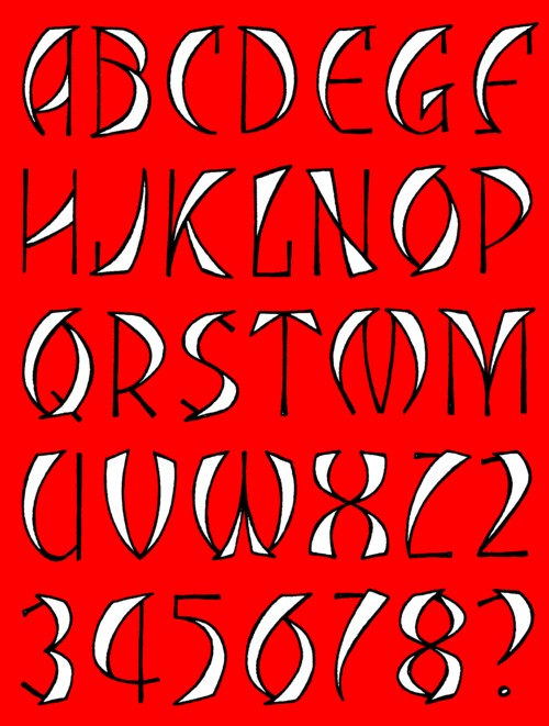
Dusty
Published: 2011-10-21 22:18:24

Amy
Published: 2011-10-15 22:17:49
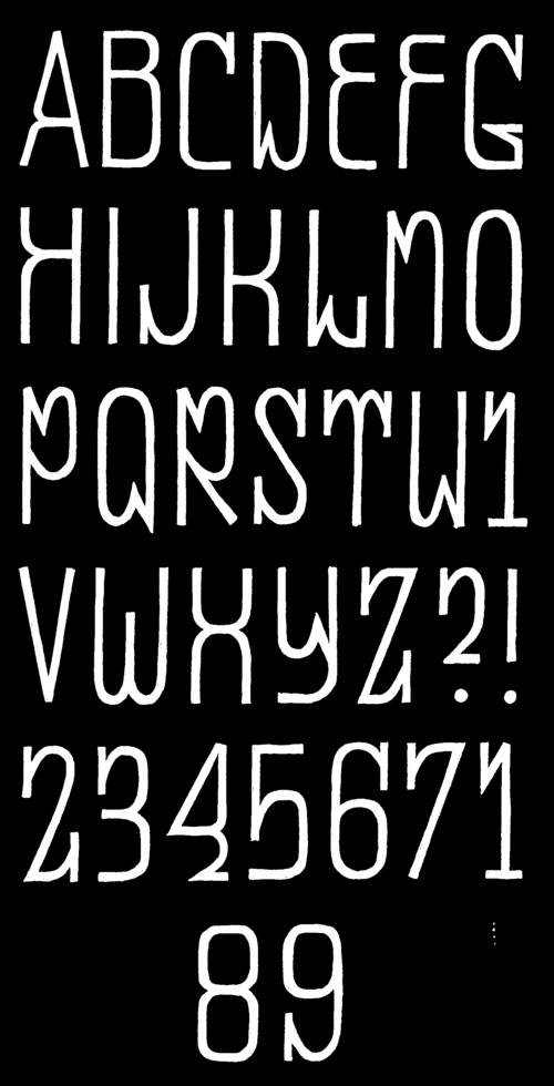
George
Published: 2011-10-08 22:15:49

Tiramisu
Published: 2011-10-01 17:44:02
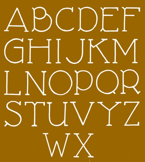
Pizza
Published: 2011-09-21 17:05:45
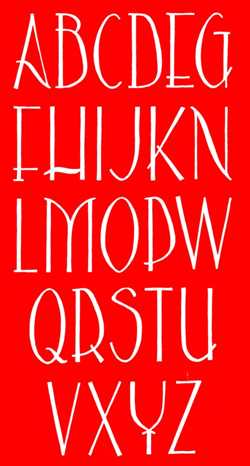
Frederique
Published: 2011-09-15 17:04:58

Nash
Published: 2011-09-08 17:04:15

Two Third
Published: 2011-09-02 13:50:22
Some of my alfabets are not made for esthetic reasons but more as a puzzle. Like this one:
 I inkted it in a way that makes it easier to see that all the letters are made of two halves that have the same form but one part is twothird the size of the other part. Ofcourse, any alfabet that is made with such restrictions lacks beauty. I guess that some letters can be improved. If you have any ideas to that, i would love to hear.
Lunettes
Published: 2011-08-28 17:03:38

Zuccini
Published: 2011-08-28 14:39:27

Garage Neon
Published: 2011-08-28 13:11:09
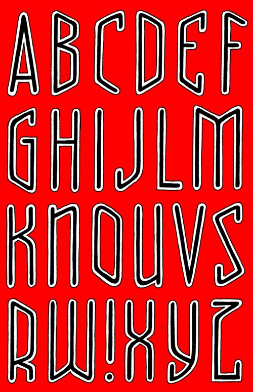
Gelateria
Published: 2011-08-28 13:10:18

Take That
Published: 2011-08-28 13:09:11
