Smeedijzer
Monday, 25 January 2010
I have an interest in “smeedijzer” designs. (Sorry, I don’t know the English word.) When we were in Lissabon last summer, I have seen some very beautiful examples, but I was there only for a day and didn’t make any photo’s. I hoped to find a book about it, but I didn’t. But last week I found this book:

It is not the book that I hoped for, but there are some beautiful designs in it. Here is just one random example:

I wanted for a long time to do something with these designs, but apart from piles of useless sketches of possible patterns in the traditional style, no idea came to my mind. Until a few days ago, when I started to incorporate letters in the designs. Next I made designs with only letters.

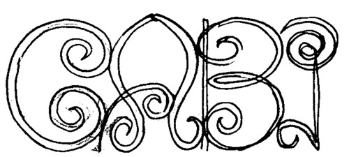
Not all words drawn/written in this way are very well readable, like this ”Showcase”:

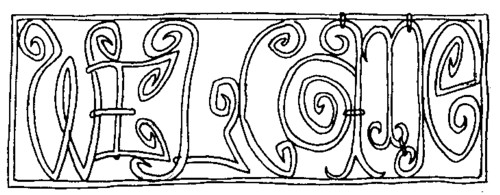
After a while I noticed that the designs look better when there is a frame around them.


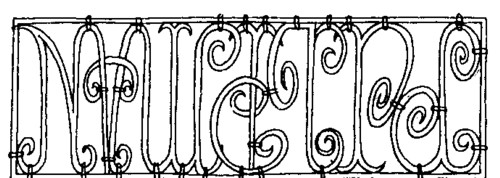
Of course, the readability depends on the words used. This sentence is probably beyond communication:

This is one of my favourites:

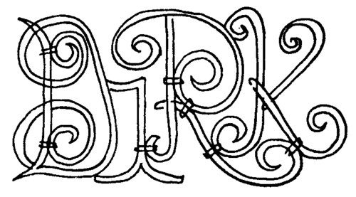
Short names work out best:

Of course I made CD cover in this style (but there is no CD yet):

If anybody wants her or his name made into a “smeedijzer” fence design, just ask.

Comments:
red+bol
2010-01-25 12:05:08
overigens weer een boekomslag waar de typografische afwerking schreeuwt om een beledigend mailtje aan de verantwoordelijke uitgever.
Rob
2010-01-25 13:00:40
KUDOS! (Spel met smeedijzeren krul, svp)
http://en.wikipedia.org/wiki/Wrought_iron
Dolf Hell
2010-01-25 15:16:53
smeedijzer= wrought iron
Aris
2010-01-26 00:49:42
He Frits,
Hoe ging dat gezegde ook al weer… eh .. o ja: Je moet het ijzer smeden als het heet is! In het Engels is het mooier: Strike while the iron is still hot.
Dus, wat let je!?
Milan
2010-01-25 10:17:12
Nice stuff! Especially the Show Case logo. Works well without the frame too. I also like the rougher line you’re using nowadays (in stead of brushes). Like the rough sixties lines.
How would “Milan” look like?